Stand out with creative interior design business cards

Stand out with creative interior design business cards
You’re working in the field of interior design, which means you’re a creative person, right? So then explain to me why you’re still handing out dull, boring business cards?
It’s past time for an upgrade if you’re still using standard cards that lack a little something something. You’ve got to stand out, especially for those times when you’re at a networking event where everyone is handing out cards like candy on Halloween.
Thankfully, Pinterest is chock full of ideas, so let’s dive into some great business cards ideas I found hot off the presses.
Modern and elegant
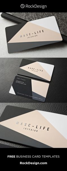
You can have a classy look but still make it edgy. Just take these three business cards: They’re all eye-catching for different reasons.
Color blocking is often used in interior design, so why not spice up your business card with the same style. I love the colors this template uses: Black, gray, white and pink. The dark colors really give this card a classic feel, and the white and pink balance it off while also adding a pop a color. Plus rose pink is very in right now and will be for a while.

This next card takes a pattern we see often — criss crossed lines — and adds some flair by roughing up the edges a bit. It’s a whimsical pattern that sticks to neutrals, which means it will never go out of style. The opposite side of the card features the designer’s initials overlayed into a sort of shield, like a crest. But it’s able to do that without being overly fussy and taking the eye away from the business’ information.

Just like in your home, you can also play with shape and texture on your business cards. This one is shaped like a house without throwing it in your face that yes this is a house. And it features an amazing geometric texture, too. Those two things make the card stand out enough, so the rest of it is more simple with block lettering in neutral tones.

Colorful and playful
Your business cards don’t all have to be exactly identical. It can be fun to use a variety of colors with the same design, just like this card that has a ton of different options for the colors of the paint brush. All the colors work together, and the paint brush icon also includes pattern with a little bit of a geometric tic, tac toe, which also adds interest. Handing these out at a networking event could be a sort of fun surprise for the other person — which color are you going to get?

This next card if one of my favorites. I love the whimsical sketch of the front door on the front, that also half-repeats on the back with a half a door. The colors are so cheerful and the circle around the door just adds to that. I don’t think this card would be the same without it. There are also cards available with whimsically drawn chairs and sofas and the like.

Blueprints
A lot of interior design involves sketching out a blueprint for the space you’re transforming, so why not include it on your business card. I love the simplicity and stylishness of blueprint cards. Architects may use these more often than interior designers, but it still fits with what we do.


Thinking outside the box
If you want to really go out there, guess what — business cards don’t need to be made of paper and don’t need to be flat. Fabric business cards are a thing! Talk about adding texture and interest, this is surely a card that they’ll never forget. I have not seen one of these in person, though, and I wonder whether the card easily fits into a card holder or wallet without the fabric getting all bent out of shape or starting to unravel. It’s a fascinating idea though.

And finally, you can make your business card its own little DIY project. How cool is this card that you fold into a chair! This would clearly stand out during any networking event and with your customers. However, I do wonder about the some assembly required nature, and ease of transport. It doesn’t look like you can see the business’ information without folding the card into chair, and after that you can’t really just pop it in your wallet or even your purse. It would get all smashed up in a second. Is everyone going to want to bother with assembling this just to get your information? It’s definitely memorable though, and perhaps a fun giveaway to a customer who has purchased from you already.


